
A product explainer video from a landing page should not read the page aloud. The landing page gives you raw material: the problem, the promise, the proof, and the CTA. The video turns those pieces into a short story a buyer can understand before they decide whether to click.
That distinction matters for PMMs, founders, and marketers. A landing page often has navigation, SEO copy, feature sections, social proof, FAQs, and multiple objections. A landing page product explainer video has a smaller job: make the promise clear, show enough product proof to feel real, and repeat the next step without asking the viewer to parse the whole page.
Why a product explainer video matters now
A product explainer video matters because buyers scan pages quickly, yet they still want enough clarity to trust the next click. Nielsen Norman Group's page-attention research found that users often leave web pages in 10 to 20 seconds, and that a page must communicate its value proposition within the first 10 seconds to earn longer attention. The same research analyzed more than 2 billion dwell times across 205,873 web pages, which is why the first frame and first sentence of the video need to carry the page's strongest promise.
The buyer-side data points in the same direction. Wyzowl's 2026 video marketing report, based on 266 respondents surveyed in late 2025, says 96% of people have watched an explainer video to learn about a product or service, 63% prefer a short video when learning about a product or service, 85% have been convinced to buy after watching a video, and 89% say video quality affects trust in a brand.
Marketers are already acting on that demand. In Wyzowl's 2026 data, 91% of businesses use video as a marketing tool, 93% of video marketers see video as an important part of strategy, 68% created explainer videos, and 93% say video helped increase user understanding of their product or service. HubSpot's 2026 marketing statistics also report that the top three ROI-driving content formats are all video-based: short-form video at 49%, long-form video at 29%, and live-streaming video at 25%.
| Signal | Current data | What it means for the video | Source |
|---|---|---|---|
| Page attention | Users often leave in 10 to 20 seconds | Open with the buyer problem and promise, not a brand intro | Nielsen Norman Group |
| Explainer familiarity | 96% have watched an explainer video to learn about a product or service | Do not over-explain the format. Focus on the specific product promise | Wyzowl 2026 |
| Preferred learning format | 63% prefer a short video for product learning | Keep the first cut short enough to finish in one sitting | Wyzowl 2026 |
| Product understanding | 93% of video marketers say video increased user understanding | Show the product moment instead of staying in abstract positioning | Wyzowl 2026 |
| ROI format | Short-form video is cited by 49% of marketers as an ROI-driving format | Make a concise version first, then expand only if sales or onboarding needs more detail | HubSpot 2026 |
The practical takeaway: a product explainer video gives sales and marketing one consistent story. Instead of every rep, founder, paid-social test, and homepage section explaining the product differently, the video compresses the approved page narrative into a reusable asset.
Prerequisites for a product explainer video from a landing page
Do not start with the page that has the most copy. Start with the page that has the least ambiguity. The best source page has one audience, one primary promise, one proof point, and one CTA.
- Audience: name the buyer or user in one phrase, such as founders evaluating AI workflow tools or PMMs launching a new product.
- Promise: pick the single change the page sells. If the page promises speed, clarity, and savings, choose the one that matters for this video.
- Proof: keep one screenshot, quote, metric, customer logo, or product workflow that makes the claim believable.
- CTA: reuse the page's next step unless this video is for a different audience, such as a sales follow-up.
- Assets: collect missing product screenshots before render, especially if the page uses abstract visuals instead of real UI.
If the page does not answer those five fields, fix the brief before generating. A vague source page becomes a vague video.
Workflow proof: what the screenshots verify
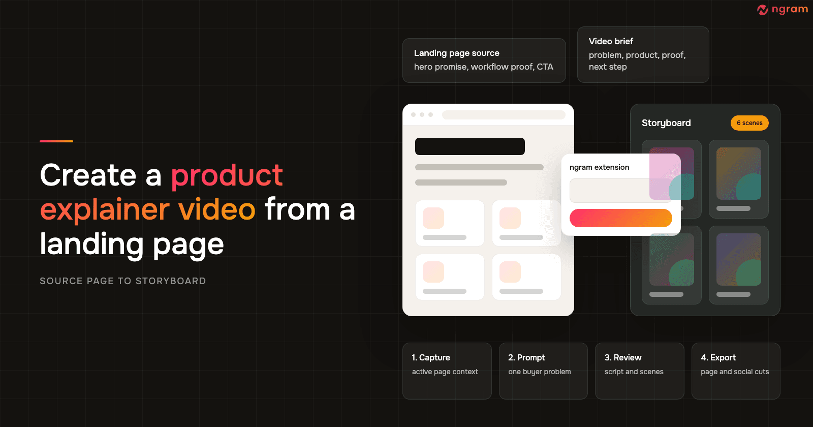
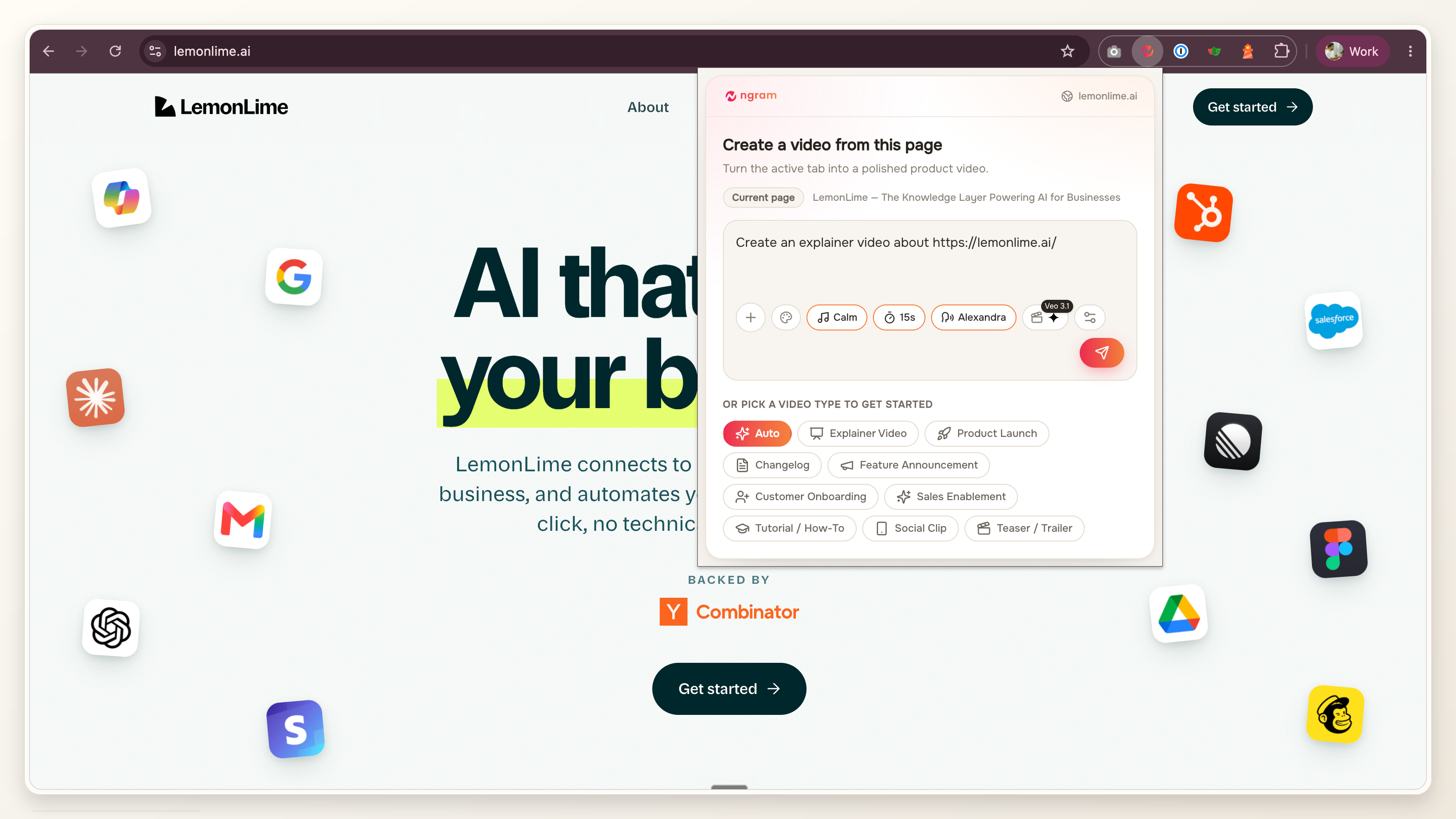
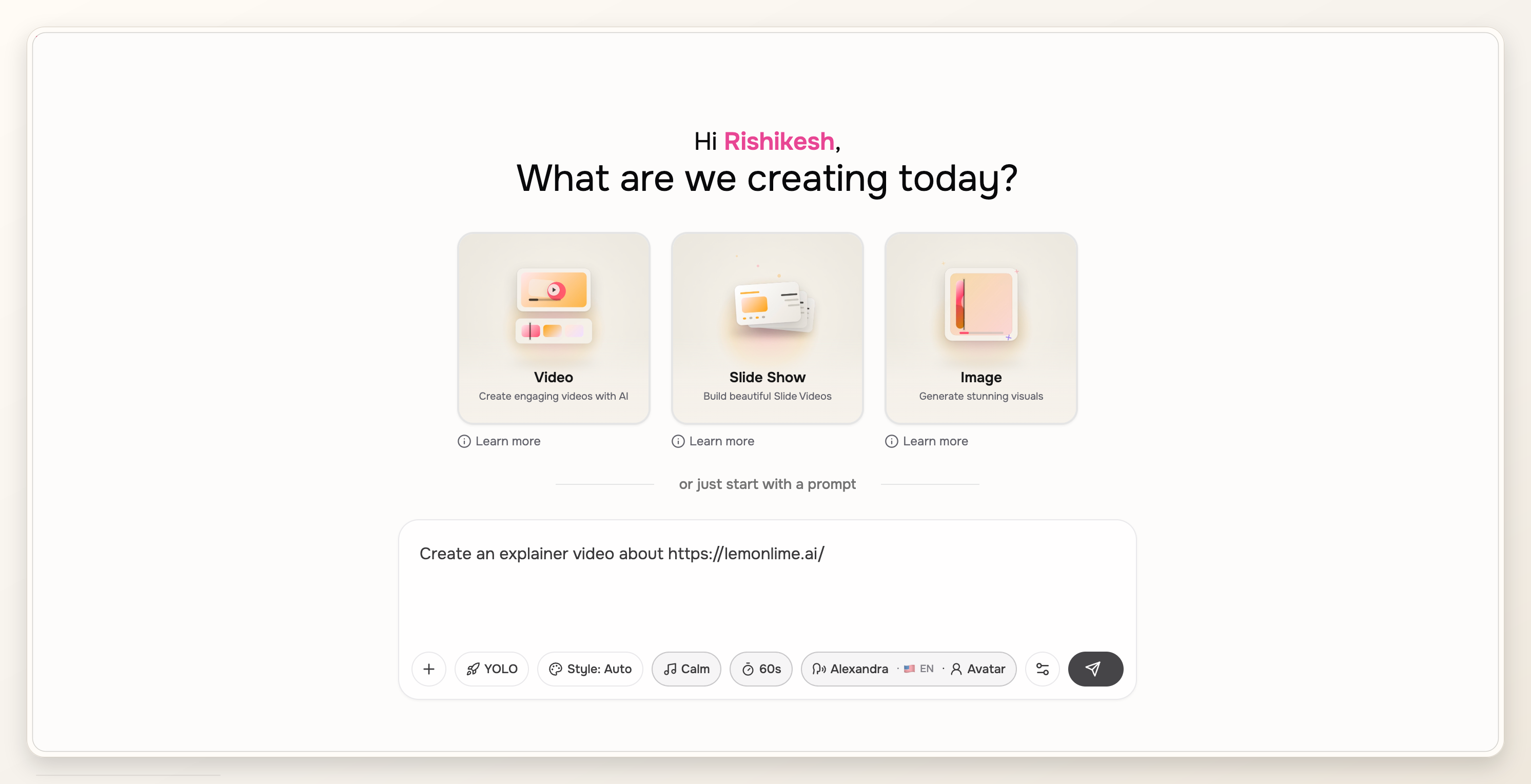
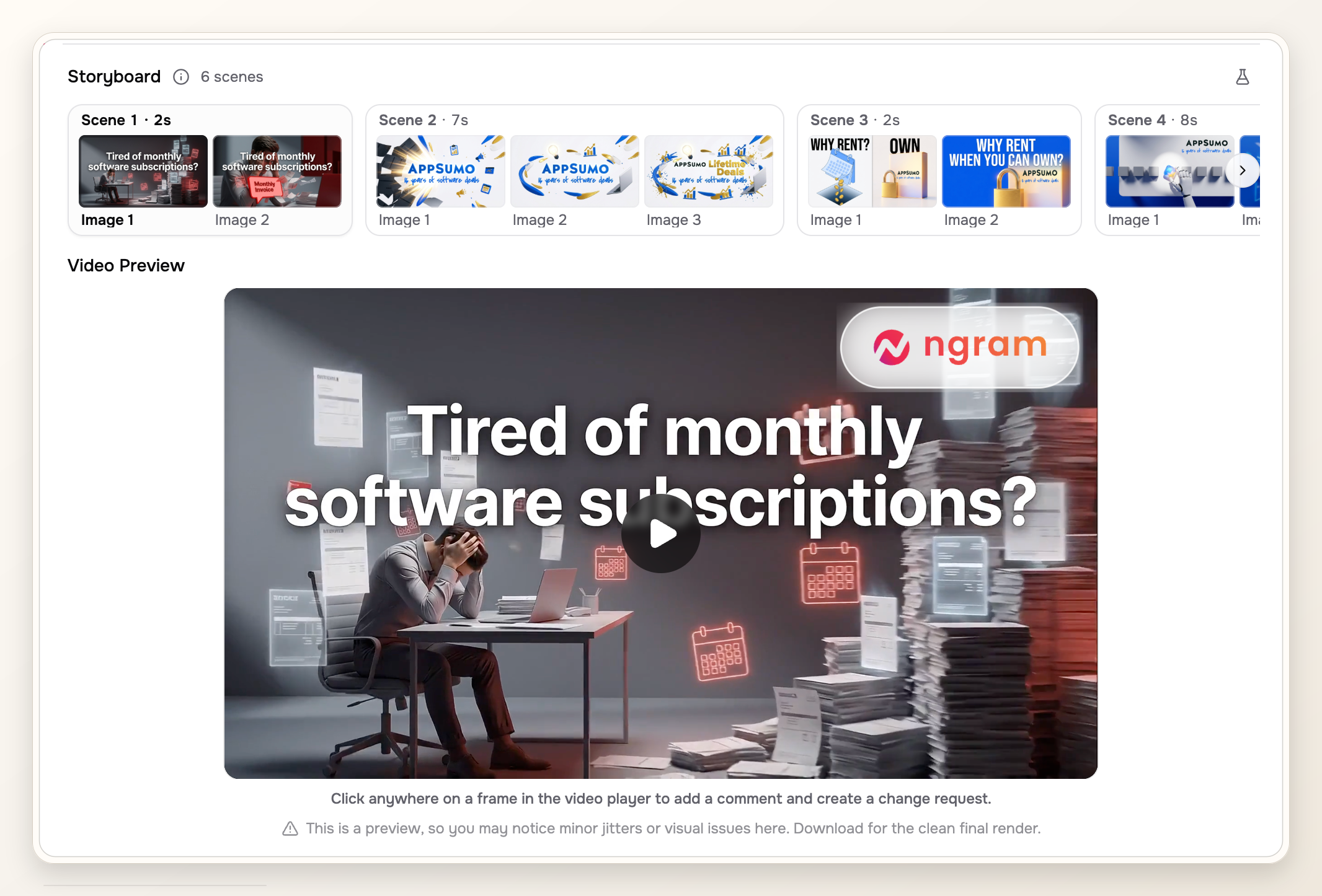
For this update, we reused the four existing proof screenshots attached to this post. They show the source landing page, the active page URL captured as source context, the prompt screen where the video starts from that URL, and the storyboard plus video preview. That supports a narrow workflow claim: ngram can use URL and page context as input, then produce a reviewable script, storyboard, and preview before final QA.
Methodology note: proof media GP-01 through GP-04 was reviewed on July 10, 2026 against the current product-state file for claim safety. The screenshots are used as product proof, not as a claim that every page will produce the same scenes, visuals, or final creative direction.
Step 1: Pass the source URL or page content into ngram
Start by giving ngram the landing page URL or the page copy. ngram's current product state supports URL ingestion, which fetches a page and extracts visual and text content for the video plan. If the page is private, gated, or still in a staging environment, paste the relevant page copy and upload screenshots instead.
For a direct source workflow, use ngram's URL to video workflow. The goal is not to scrape every sentence. The goal is to hand ngram enough source context to identify the headline, promise, proof, CTA, and product visuals.
Step 2: Choose a product explainer intent
Choose the product explainer intent before writing a prompt. That tells the draft to prioritize clarity over feature coverage. A good explainer has a different shape from a product demo, launch teaser, tutorial, or paid ad.
Create a 60-second product explainer video from this landing page. Open with the buyer problem, show the product moment that solves it, use one proof point from the page, and close with the page's primary CTA.
If the page supports multiple audiences, add the audience in the prompt. For example: make this for product marketers evaluating launch workflows, or make this for a founder explaining the product to first-time visitors. The AI explainer video maker page is the closest internal reference when your source is a mix of URL, prompt, screenshot, and product note.
Step 3: Turn page sections into a product explainer video story
A concise landing page video usually works best as six scenes. Wyzowl's 2026 report says 71% of people believe videos between 30 seconds and 2 minutes are most effective, so treat 45 to 90 seconds as the first draft range unless the page is unusually technical.
- Problem: name the pain the page is built around.
- Stakes: explain what stays slow, expensive, risky, or unclear without the product.
- Product reveal: show the product or output before the midpoint.
- Workflow: show the one action the user takes, not every feature.
- Proof: use the strongest page proof, such as a screenshot, metric, testimonial, or before-and-after result.
- CTA: close with the same next step the page asks for.
This structure gives the video a tighter spine than a page summary. It also gives sales and marketing a consistent story: what hurts, what changes, why believe it, what next.
Step 4: Review the product explainer video script and storyboard
ngram generates a script and storyboard before you commit to the final render. Use that review step aggressively. Cut scenes that sound like the landing page navigation, merge repeated benefits, and rewrite any line that does not point to a visible product moment.
- Scene 1: Does it name a buyer problem in plain language?
- Scene 2: Does it explain the cost of doing nothing without sounding dramatic?
- Scene 3: Does the product or output appear early enough?
- Scene 4: Does the workflow show action instead of listing features?
- Scene 5: Does the proof support the main claim?
- Scene 6: Does the CTA match the page button or sales motion?
Step 5: Add missing screenshots, proof, and product context
Landing pages often use polished hero graphics, but a product explainer video needs evidence. If the generated storyboard has a proof scene with no proof, upload the missing screenshot or point ngram to the part of the page that should anchor the claim.
The highest-value additions are usually a real product screen, a customer quote, a before-and-after result, a short workflow recording, or the final output a user gets from the product. For a broader versioning plan, the product explainer video maker use case maps the same source material into website, sales, and social versions.
Step 6: Tune product explainer video length, voice, first frame, and captions
Once the storyboard is right, tune the production layer. ngram supports captions, AI voiceover, visual direction, and editor review, but the defaults still need a placement decision.
- Length: keep the main version inside 45 to 90 seconds for most landing pages. Use a longer cut only when a sales or onboarding use case needs more detail.
- Voice: choose a voice that matches the buyer's expectation. A technical B2B page usually needs a calmer read than a launch teaser.
- First frame: make the first frame readable and specific. It should work when the video autoplays silently.
- Captions: check line breaks, contrast, timing, and mobile readability before render.
- CTA: use the page's CTA for the website version, then soften it for a sales follow-up if needed.
Step 7: Render, watch, and request edits
Render only after the storyboard passes the message check. Then watch the cut without looking at the landing page. If a first-time viewer would not know who it is for, what changed, and what to do next, request edits before sharing the video with sales or adding it to a campaign.
For a companion walkthrough on the source-input side, see how to generate video from a website URL. Use that when the hard part is getting clean source context from a live page before you start the explainer story.
QA checklist for a product explainer video
Use this QA pass before you treat the video as finished. Most weak landing page videos fail on story fit, proof, or readability, not on rendering.
- The first 10 seconds match the landing page's core promise.
- The product or output appears before the midpoint.
- Every proof claim appears on the page, in uploaded screenshots, or in approved source material.
- Captions are readable on a phone with sound off.
- The first frame is clear enough to work as a thumbnail or autoplay frame.
- The voice sounds credible for the buyer and product category.
- The CTA repeats the page's primary action or a deliberate sales-follow-up action.
- The video can stand alone if a sales rep sends it without the page attached.
FAQ
How long should a product explainer video be?
For a landing page, start with 45 to 90 seconds. Wyzowl's 2026 report says 71% of people believe 30 seconds to 2 minutes is the most effective video length, so a concise first cut gives you room to clarify without turning the video into a full demo.
Can ngram make a video from any landing page URL?
ngram supports URL ingestion for public pages. If a page is private, blocked, or still in draft, paste the page content and upload screenshots so the script and storyboard still have source material.
What should I add if the landing page has weak proof?
Add the asset that makes the promise believable: a product screenshot, a workflow recording, a customer quote, a result metric, or a before-and-after example. If you do not have proof yet, keep the video narrower and avoid making a claim the page cannot support.
Should the landing page video use the same headline?
Use the same promise, but do not force the exact headline into the script. A headline can be compressed and static. A video line needs to sound natural, show the product moment, and move quickly to proof.
What is the difference between a product explainer and a product demo?
A product explainer answers why the product matters and who it is for. A product demo shows how the product works in more detail. If the landing page is for first-time buyers, make the explainer first, then create a deeper demo for sales or onboarding.