What We Found (And Why It Matters)
Product demo videos are no longer nice-to-have. According to Wyzowl's 2026 Video Marketing Report, 82% of video marketers report positive ROI from video content. And 80% of people have bought or downloaded an app after watching a demo video.
But not all demos are created equal. Some make you lean in. Others make you close the tab.
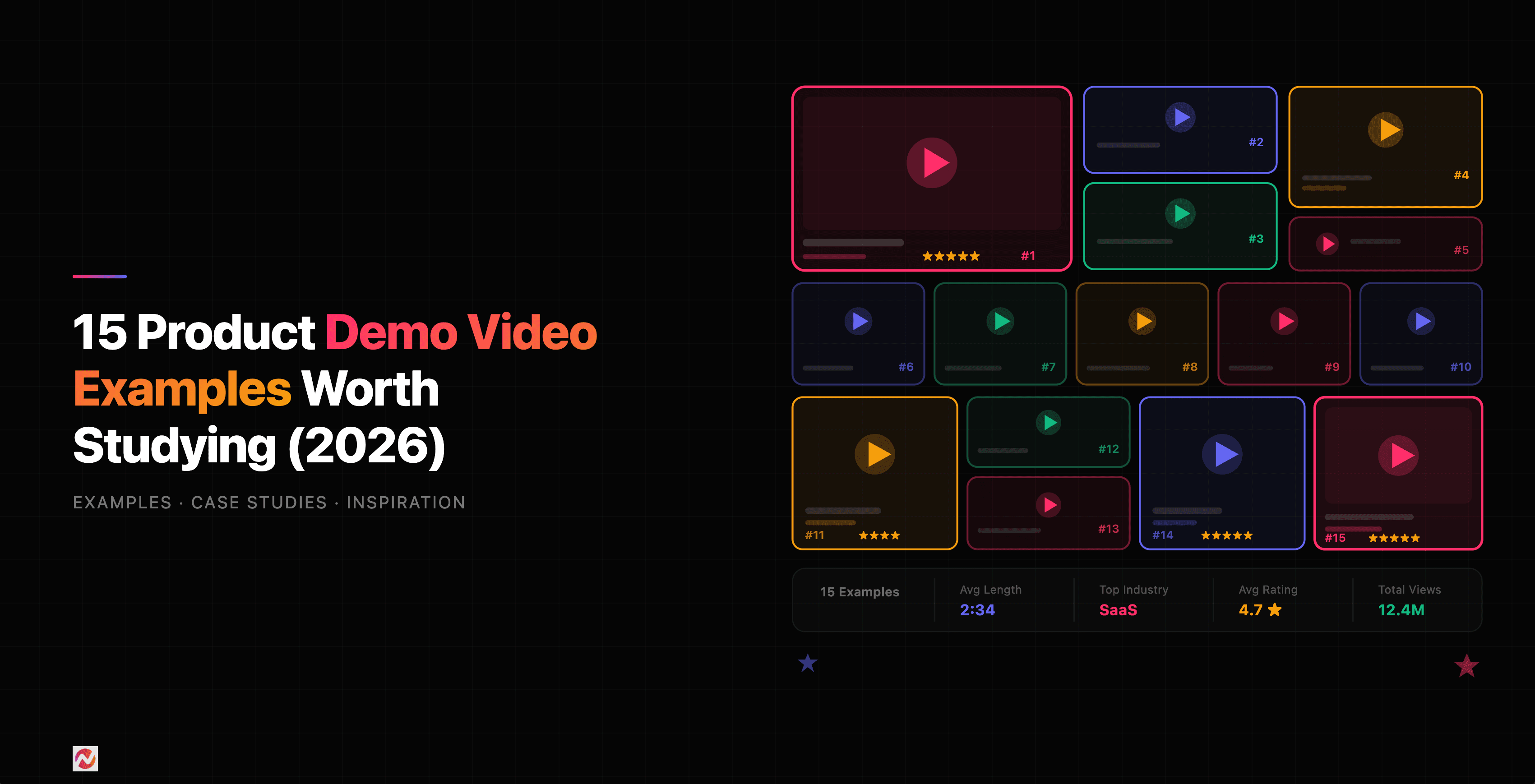
We analyzed 13 real demo video examples across different industries and styles. Here's what separates the ones that work from the ones that don't.
Best Overall Demo Videos
1. Notion
What they do: All-in-one workspace for notes, databases, and project management.
Why it works: Notion's demo opens with a feeling, not a feature list. "We all crave clarity and organization. We want a quiet space to think." That emotional setup does something powerful: it makes you nod before the product even appears. Once it does, the video shows a polished walkthrough of the Notion UI, not a raw screen recording, but a carefully choreographed tour where every action on screen matches what the narrator is describing. You see pages being created, content being dragged and dropped, databases being built, and teams collaborating across time zones. The pacing is calm and deliberate, letting each feature breathe instead of rushing through a checklist. It closes the same way it opened, with a feeling: "a calm, clear place to focus on the things that actually matter to you." The whole thing feels like a product philosophy wrapped in a demo.
Key takeaway: Open with the problem your audience feels, not the feature you built. When viewers see their own frustration reflected, they lean in before your product even appears.
2. Canva
What they do: Drag-and-drop design platform.
Why it works: This is one of the most efficient demo videos you'll find. In under a minute, Canva walks you through templates, elements, color customization, text editing, animation, and export, all inside the actual product. But what makes it stand out is the execution. This isn't a basic screen recording where someone shares their screen and clicks around. Every interaction is zoomed in at the right moment, every UI element is highlighted exactly when the narrator mentions it, and the transitions between features feel seamless. You never lose track of where you are. The script is pure instruction: "Select the object you want to change," "Double-click to edit text," "Click the page, open the animate tab." No filler. No branding speech. Just show and tell. It ends with "Now it's your turn," which is the perfect CTA for a design tool: it assumes you're ready to create.
Key takeaway: When your product is visual, let the product do the talking. Strip the script down to instructions and let every second show something happening on screen.
3. Duolingo
What they do: Language learning app.
Why it works: This demo barely qualifies as a demo and that's exactly why it works. In roughly 30 seconds, Duolingo communicates three things: it's free, it's fun, and it's effective. Instead of showing the app interface, the video follows an animated character moving through different environments, interacting with people in different languages. It feels like a Duolingo ad and a product demo at the same time because the character's experience IS the demo: learning a language that actually works in the real world. This is the Duolingo brand in a bottle. Their entire identity, playful animation, approachable tone, zero friction messaging, is packed into the shortest video on this list. The brevity is a strategic choice. For a free consumer app, the demo's job isn't to explain features. It's to make you tap "download" before you overthink it.
Key takeaway: If your product is simple and the barrier to entry is low, your demo should match. Don't over-explain. Get to the emotional payoff fast and end with a clear action.
Best Demo Videos for SaaS
4. Slack
What they do: Workplace communication platform.
Why it works: Slack's demo opens with a problem statement that hits hard: "Work doesn't work the way it used to. Knowledge is siloed. Data is fragmented. Context switching is constant. Work is actually broken." That framing does something important: it positions Slack not as a messaging app but as an operating system for work. The video then uses a combination of motion graphics and Slack UI clips. When the narrator talks about AI-powered search, you see the search interface. When they mention Workflow Builder, you see automation being configured. But between those product moments, animated sequences keep the energy high and communicate abstract ideas like "bringing people, agents, AI, apps, automation, and data together." Slack doesn't try to walk you through every feature in the sidebar. It picks the five or six highest-value capabilities, AI search, recaps, Salesforce channels, Agentforce, Workflow Builder, and goes deep enough on each to show real value. The structure is essentially: "Work is broken" → "Slack brings everything together" → "Here's how, specifically" → "The most innovative companies rely on Slack."
Key takeaway: When your product does many things, don't try to show all of them. Pick the five capabilities that matter most to your audience and go deep enough to prove value.
5. Zapier
What they do: Automation platform connecting apps.
Why it works: Zapier's demo team made an interesting creative choice: instead of showing the product interface, they put a real person on camera and used simple animated slides to explain what a Zap is. The structure is brilliantly simple: a Zap has two parts, a trigger and an action. The trigger tells it when to start. The action is what it does. That's it. The example is relatable: "If you're like me, you spend most of your day in Slack, so that's where you want the reminder to go." The animated slides illustrate the trigger-action model visually while the presenter talks through it. The decision to skip the UI and focus entirely on the concept is what makes this demo memorable. By the time you finish watching, you understand triggers and actions, and that mental model is what makes someone want to go try the product. This is a demo that teaches you how to think about automation before asking you to build anything.
Key takeaway: Sometimes the most effective demo doesn't show the product at all. If your audience needs to understand a concept before they can appreciate the interface, consider leading with the idea and letting the product discovery happen after.
6. Monday.com
What they do: Work management and project tracking software.
Why it works: This is the most comprehensive demo on our list, and it earns its length. Monday.com walks through an actual use case, their own IT department's ticket management board, from creating the first board to adding columns, setting up statuses, building forms, creating views, and configuring automations. Then it jumps to their marketing team to show cross-team collaboration. Then to sales CRM with integrations. Then to dashboards for executives. What makes this work despite the length is that every feature is shown in context. You don't just see "here's a timeline column." You see "we add a timeline column to make sure we solve all tickets in a timely manner." The demo crosses departments: IT, marketing, sales, leadership, each with their own board and their own workflow. This is smart because Monday.com's buyers are diverse. An IT manager watching this says "that's my workflow." A marketing lead says the same thing two minutes later. They even sneak in a personality moment: "grow a llama farm to have some fun with your team's progress" on the dashboard section.
Key takeaway: If your product serves multiple personas, show each one's workflow specifically. Let each buyer see themselves in the demo rather than asking them to imagine the translation.
Best Short-Form Demo Videos
7. Superhuman
What they do: AI-powered email client.
Why it works: This demo has zero voiceover. No narrator. No talking head. Just the Superhuman UI doing its thing, and it's mesmerizing. You watch someone select text in an email, click the AI button, and the text transforms: translated to French, rewritten in a different tone, shortened, expanded, whatever you ask. Each feature is demonstrated through pure interaction. Select text. Click AI. See the result. The absence of narration is a deliberate creative choice that serves two purposes. First, it lets the speed of what's happening on screen speak for itself. When the AI rewrites text in under a second, you don't need someone telling you it's fast; you can see it. Second, it creates a feeling of effortlessness: just you and the interface, no interruptions. The standout moment is the "Write it in my voice" feature. The demo shows the AI converting text to match the user's own writing style. No explanation is given for how it works. The before/after just appears on screen, and that unexplained transformation is what makes it feel like magic.
Key takeaway: When the thing that makes your product impressive is visible on screen, strip away everything else. No narration needed if every frame is already doing the selling.
8. Loom
What they do: Instant video messaging for async communication.
Why it works: Loom takes a completely different approach: they made a short film. It opens with someone in a cafeteria staring at a laptop full of meetings. Another person walks over and asks "Why don't you replace some of those meetings with a Loom?" What follows is part comedy sketch, part product demo. The characters walk through a metaphorical "office of the future" where a work document is criticized for lacking "layers, depth, dimension... it lacks YOU." The person actually records a Loom during the video, and you watch them go from hesitant ("Okay, here goes...") to confident ("Hi everyone, these are the numbers from the latest sales report..."). Then the payoff: a colleague responds not to a document, but to a real person, saying "you saved us from yet another all-hands meeting." It's entertaining enough that you forget you're watching a product demo. But by the end, you understand exactly what Loom does and why it matters, all because they showed the before (endless meetings) and after (a quick video that gets the same job done).
Key takeaway: Storytelling works when the story IS the use case. Show a character experiencing the problem, discovering the product, and getting a better outcome, and your viewer lives the demo instead of watching it.
Best Demo Videos for Sales
9. HubSpot
What they do: CRM and marketing automation platform.
Why it works: HubSpot's demo does something clever: it sells the platform, not individual products. The video opens with "Welcome to the HubSpot Customer Platform" and immediately emphasizes that all products, Marketing Hub, Sales Hub, Service Hub, and more, are built on a single unified system. The key phrase: "All your customer-facing teams use the same system of record." That's the value proposition, not any one feature. Animations carry the visual storytelling, with Hubspot UI appearing when specific capabilities need proof. The structure follows a clear arc: connected platform → Smart CRM → centralized data → AI insights → integrations → easy to get started. What makes this effective for sales is the framing around the buyer's journey. HubSpot doesn't just show what the tools do; it shows what that means for the customer: "you'll gain incredible insight into each stage of the customer's journey." It ends with a low-pressure ramp: "Start with our free tools and upgrade as you grow." That one line handles the objection that enterprise platforms are too expensive or complicated to start with.
Key takeaway: When you sell a platform with multiple products, lead with what connects them, not what each one does individually. Unified data and connected workflows are more compelling than a product-by-product tour.
10. Salesforce
What they do: Enterprise CRM and business software.
Why it works: Salesforce's demo takes on a huge scope: CRM, AI, data integration, metadata, a co-pilot, and Slack, all in one video. They solve the complexity problem by starting with the basics: "Not sure what CRM is? I got you." A presenter walks through slides and product UI, building from simple (CRM manages customer data) to complex (Data Cloud connects external systems, metadata creates a common language, Einstein AI scales across the business). The video is long, but it's structured like a course. Each concept builds on the previous one: CRM → Einstein 1 platform → specific use cases (marketing, sales, service) → Customer 360 → data unification → metadata → AI → co-pilot → Slack integration. The "Customer 360" concept is the anchor point that ties everything together: every department seeing the same view of every customer. The presenter circles back to it repeatedly, which keeps viewers oriented even as the complexity increases. The conversational tone makes enterprise software feel accessible: "Yeah, good brain thinking" after explaining metadata. It doesn't try to be cool; it tries to be clear.
Key takeaway: For complex products, structure your demo like a course. Build concepts layer by layer, give each layer a name, and keep circling back to the core idea so viewers never lose the thread.
Best Demo Videos for Onboarding
11. Figma
What they do: Collaborative design tool.
Why it works: Figma's demo is pure brand animation. Not a single frame of the actual Figma UI appears, and that's a bold creative choice for a design tool. Instead, custom animations using Figma's own brand colors and visual identity illustrate every concept: collaboration, real-time editing, developer handoff, stakeholder feedback. The opening line nails the positioning: "We know that design is more than how something looks. It makes people feel. It makes people act. It makes a good product great." Then the twist: "But for all the good design out there, the design process is often a mess." Files passed back and forth. Endless final versions. Nobody has the right fonts. The animation style itself does double duty. Every visual is polished, purposeful, and cohesive, so the craft of the demo reflects the craft of the brand. By choosing not to show the UI, the demo team puts all the weight on the philosophy: design is a team sport, not a solo act. The language reinforces this: "handoff more like a handshake," "get on the same page, literally." The video trusts that viewers who connect with that philosophy will go explore the product on their own.
Key takeaway: Skipping the UI is a valid creative choice when your demo's goal is to sell the "why" before the "how." Brand animation can build emotional connection that a product walkthrough can't, especially when the animation itself demonstrates craft.
12. Asana
What they do: Project and portfolio management tool.
Why it works: Asana's demo plays like a mini-documentary. It opens with real people in real scenarios: teams overwhelmed by busy work, tools that don't connect, goals pushed further out of reach. You see the frustration on actual faces before Asana enters the picture. The video gives the problem real weight with a specific stat: "busy work draining almost 3 days a week from everyone." That number turns a vague pain into a measurable one. Then the transition: "But now there's a smarter way to work." The second half shifts to the Asana UI, showing how work connects to company-wide goals, how teams get clarity on who's doing what by when, and how AI uses real-time work data to inform decisions. The video covers manufacturing, healthcare, logistics, media, finance, and more in rapid succession, which signals enterprise scale without needing a 10-minute walkthrough for each industry. It closes with social proof: "more than 100,000 customers and partners trust" Asana.
Key takeaway: Show the pain before the product. When viewers see real people struggling with a problem they recognize, the solution feels inevitable rather than pitched.
13. Intercom
What they do: Customer communication and support platform.
Why it works: Intercom leads with a bold claim: "The future of customer service is AI." Then immediately qualifies it: "But not just any solution can get you there." That two-line setup creates a framework for the entire demo. The video is almost entirely UI-driven, showing Fin (their AI bot) resolving questions from a knowledge base, routing complex issues to the help desk, AI Assist helping agents work faster, tickets tracking progress in real time, and proactive support tools sending in-context messages. The structure follows the support workflow: AI bot handles common questions → complex ones route to the help desk → resolved answers feed back into the bot for future use. That last part, "your team never has to answer the same question twice," is the moment that sells the flywheel. Small animations appear between screens to emphasize key concepts like "AI" and "Fin," but the demo stays grounded in the actual product. This is a demo for buyers who need to see the tool working, not just hear about it. The closing line, "built for an AI-first world," lands because the entire video just proved it.
Key takeaway: For product-led demos, show the complete workflow, not isolated features. When viewers see how each piece connects to the next, they understand the system, not just the parts.
What Makes These Demo Videos Effective?
Here's what we found across all 15 examples.
They Answer One Question Clearly
Each demo has a single clear answer: "Does this solve my problem?" They don't try to explain everything. They show the thing that matters most and let the rest be discovered later.
They Show Real Workflows
None of these demos show an empty product or feature in isolation. They show the product doing its job for a real person with a real problem.
They Respect Your Time
The best demo videos are short. Most of the examples above are under 3 minutes. Some are 30-60 seconds. This constraint forces clarity. You can't waste time with a 90-second video, so every frame counts.
They Use Motion Strategically
Animations and transitions are there for a reason in these demos, not just decoration. Motion draws the eye to what matters and keeps pace with the narration.
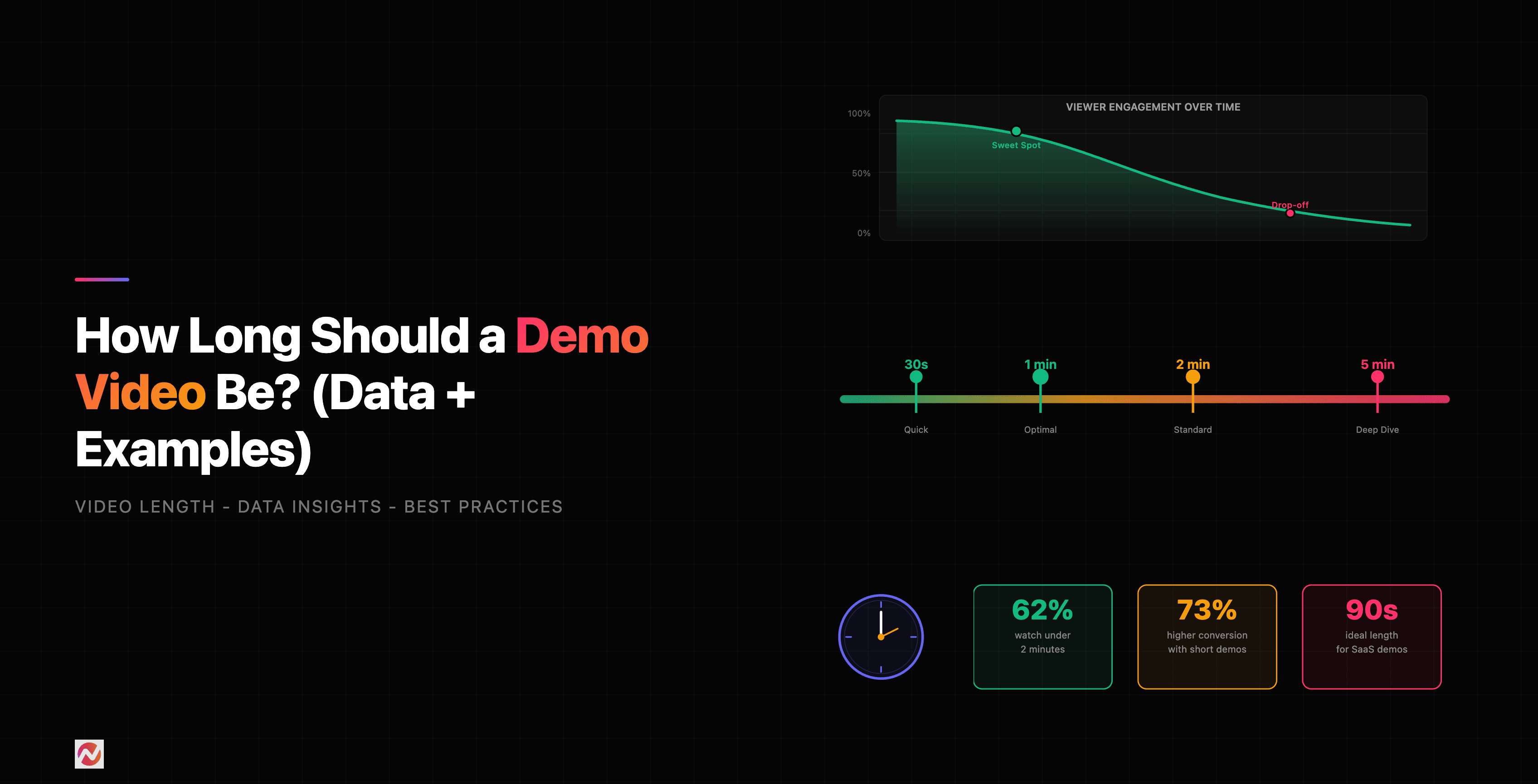
Here's how demo video length impacts engagement and effectiveness.
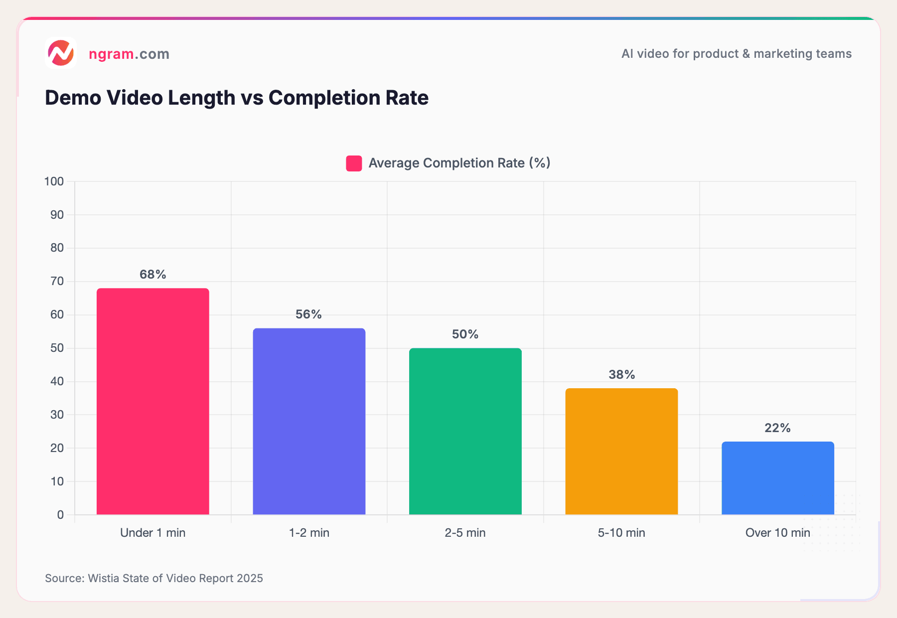
Source: Wistia State of Video Report 2025
Viewers who start a demo under 1 minute have a 68% completion rate. Stretch it to 5 minutes and that drops to 50%. Push it over 10 minutes and only about 1 in 5 viewers finish. Time is a constraint, and the best demos work within it.
Demo Video Styles by Industry
Different industries use different approaches. Here's what works in each.
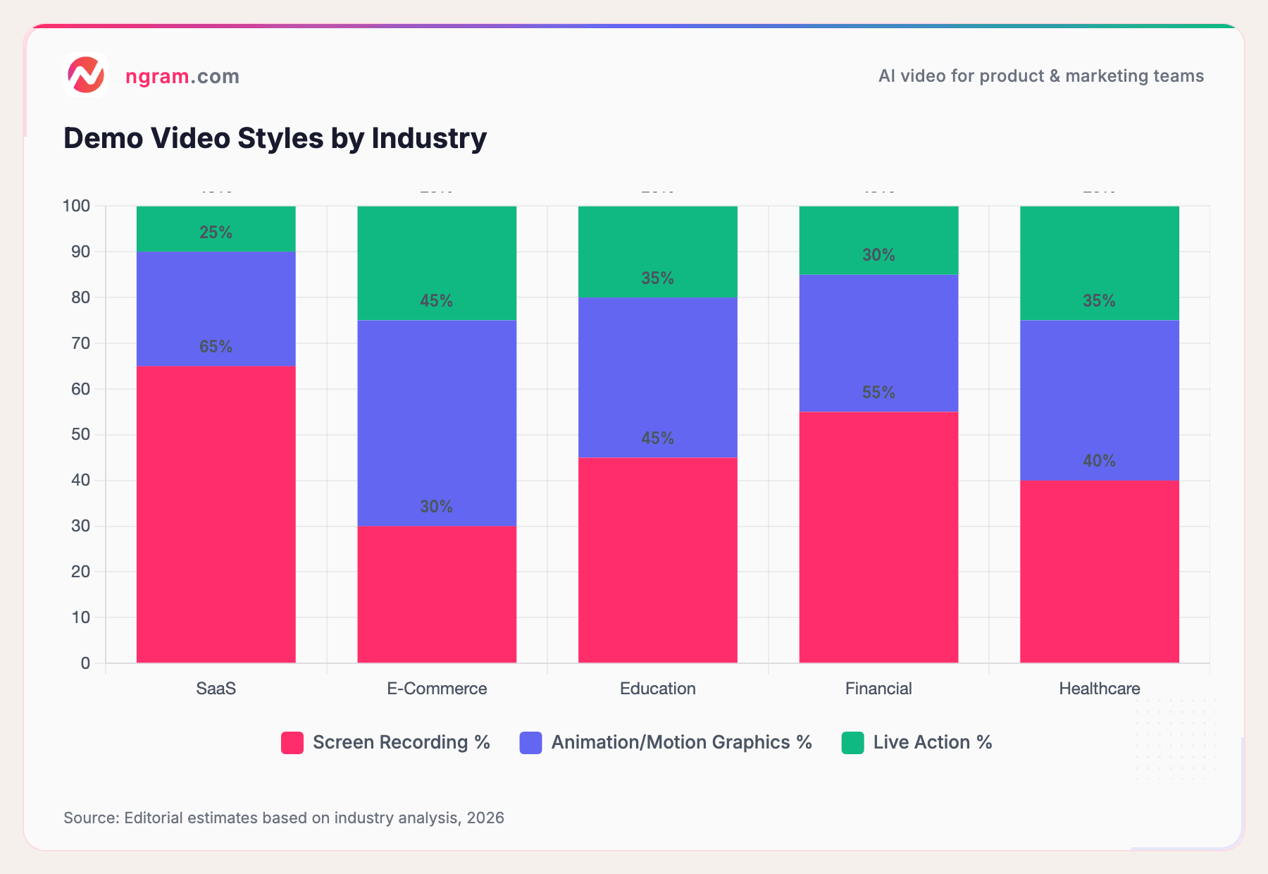
Source: Editorial estimates based on industry analysis, 2026
SaaS companies lean on screen recordings with voiceover. E-commerce brands use more animation and lifestyle footage. Healthcare and finance balance professionalism with clarity. Choose a style that matches your industry and audience expectations.
What You Can Learn From These Examples
If you're creating demo videos for your own product, here's what these 15 examples teach us.
1. Start With Your Hardest Question
What's the one thing prospects ask about? Make your demo answer that first. Everything else is detail.
2. Show, Don't Tell
Don't describe features. Show the product solving a real problem. Demonstrate the workflow, not the interface.
3. Use Real Scenarios
A sales rep using your CRM to close a deal beats a generic walkthrough. A marketer organizing a campaign beats "our platform is organized." Specificity is persuasive.
4. Script for Clarity, Not Completeness
Your script should highlight the core value. Skip the "here's the menu bar" stuff. Your viewer is smart enough to find that on their own.
5. Polish the Visuals
A blurry screen recording or bad lighting immediately signals amateurism. Invest in quality. Crisp screen recording, good audio, and professional editing go a long way.
6. Include a Clear Next Step
Don't end the demo without a call-to-action. "Try it free," "Book a demo," "Download the guide." Without it, viewers don't know what to do next.
If you're creating demo videos at scale and want to spend less time on editing and more time on impact, that's where ngram's demo video maker comes in. Turn raw screen recordings into polished demos in minutes. We handle the editing, the pacing, and the visual polish so you focus on the message.
Tools and Tactics Used by These Companies
Most of the companies we studied use one of these approaches:
Screen Recording + Voiceover Simplest and most common. Loom, Slack, and Monday.com all use this. It's cost-effective and fast.
Screen Recording + Motion Graphics Zapier and Figma combine screen recordings with animated callouts and transitions. This adds polish without the cost of full animation.
Animation with Real Footage Canva and Duolingo mix animation with real user interactions. The animation explains concepts, the real footage shows authenticity.
Case Study Format HubSpot and Salesforce show real customers and their results. This adds credibility but requires more planning.
Frequently Asked Questions
How long should a demo video be?
Aim for 2-3 minutes maximum. According to our research, demo videos under 2 minutes have a 56-68% completion rate. If you have more to cover, break it into multiple short videos instead of one long one.
Should I include my product's UI in the demo?
Yes, but as a means to an end. Show the interface only as much as needed to understand the workflow. Don't demo the entire UI. Focus on the path to value.
What should I say in the voiceover?
Voiceovers should be natural and conversational. Avoid corporate jargon and marketing-speak. Imagine explaining your product to a friend, not pitching to a crowd. According to Wyzowl's 2026 Video Marketing Report, 85% of people have been convinced to buy a product after watching a video, and conversational tone was a key factor.
Do I need animated graphics?
No. A clean screen recording with good audio beats a fancy animation with unclear messaging. Animations help when they simplify complexity. Otherwise, keep it simple.
Can I use a demo video in multiple channels?
Yes, but adapt it. A 3-minute demo works on your website. Cut it to 30 seconds for social. Create a variant focused on a different use case for your sales team. Same core message, different formats for different audiences.
How do I measure if my demo video works?
Track these metrics: Completion rate, click-through rate on your CTA, traffic to your sign-up page after the video view, and feedback from your sales team. If viewers finish the video and take action, it's working.
What's the difference between a demo video and an explainer video?
A demo video shows your product in use solving a specific problem. An explainer video teaches a concept or process. Demos are product-focused. Explainers are concept-focused. Both have their place, but if you're introducing a new product, you need a demo.
Should I show my competitors in a demo video?
Mention competitors only if you're directly addressing a comparison. Most of the time, focus on your product and its value. Viewers came to learn about you, not your competition.
What's Next?
You've seen what the best demo videos look like. Now it's time to create your own. Start by answering this: What's the one thing your product does better than anything else? Make that the hero of your first demo.
If you want to speed up the process, ngram's auto-editing features can help you turn raw recordings into polished demos. Focus on what you're great at. We'll handle the rest.
The companies we studied understand one core truth: a great demo video doesn't sell features. It shows how your product makes someone's life better. That's the formula. That's what converts.